
The bedroom is an intimate and personal space where we seek to rest and relax after a long day. Choosing the right colors can have a significant impact on the atmosphere and sense of tranquility we experience in this space. On this occasion, we want to help you choose the best colors for the bedroom. In addition, we will show you how to combine them and offer you additional considerations when choosing the shades for this important space in our home.
Neutral colors and soft tones
Neutral colors and soft tones are popular choices for the bedroom as they create a feeling of calm and serenity. These subtle shades also offer a neutral base that can be easily combined with other shades and decorative elements.
White: purity, clarity and a feeling of spaciousness
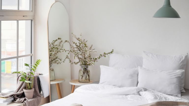
White is synonymous with purity and clarity. In the bedroom, it can create a feeling of spaciousness and lightness, making it an excellent choice for smaller spaces or spaces with little natural lighting. In addition, it provides a neutral base that allows other decorative elements and accessories in the room to stand out.
Beige: warmth and tranquility
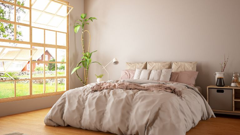
Beige is a warm color that conveys a feeling of calm and tranquility. It is a popular choice for the bedroom for its ability to create a cozy atmosphere. Beige pairs well with other soft, neutral tones, allowing for a wide range of options for decor and textiles.
Gray: elegance and versatility
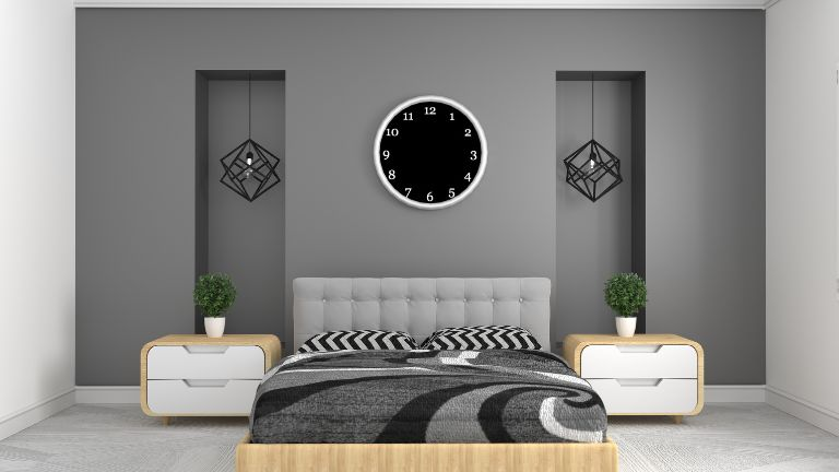
Gray is a versatile shade that can adapt to different styles and decorative preferences. This elegant tone conveys a feeling of tranquility and harmony in the bedroom. For example, light gray can help create a soft, relaxing environment, while darker tones add depth and sophistication to the space.
Pastel tones: softness and delicacy
Pastel tones, such as soft pink, light blue or light lilac, are popular options for those who want to add softness and delicacy to their bedroom. These colors create a feeling of serenity and are associated with calm and relaxation.
Pastel tones can also be used as accents or decorative details to provide a subtle touch. We recommend that you get inspired by looking at the catalog of the various online furniture stores that you can find within your reach.
Warm colors for a cozy atmosphere
If you are looking to create a cozy atmosphere in your room, warm colors are an excellent option. These tones convey warmth, energy and vitality, making them great options for spaces where you want to feel embraced and comfortable.
Earth tones: connections with nature and a feeling of warmth
Earth tones, such as brown, terracotta and ocher, evoke a connection with nature and convey a feeling of warmth in the bedroom. These earthy tones create a cozy and organic atmosphere, creating a feeling of tranquility and harmony with the environment.
In this case, you can use earth tones on the walls, furniture or decorative elements to create a cozy and earthy atmosphere in your bedroom.
Soft yellows: energy and luminosity
Soft yellow is a warm and bright color that transmits energy and joy. This shade can be an excellent option for those looking to wake up with a positive and optimistic attitude. However, it is important to use soft shades of yellow to avoid it being too stimulating in the bedroom.
A subtle touch of yellow in textiles, such as curtains or pillows, can add a touch of lightness and vibrancy to the space.
Cool colors for a feeling of calm and relaxation
If you prefer to create a feeling of calm and relaxation in your bedroom, cool colors are the perfect choice. These tones transmit serenity and freshness, helping to create a calm and peaceful environment.
Soft blues: tranquility and serenity
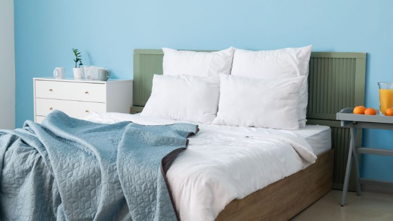
Soft shades of blue, such as light blue and light blue, are known for their ability to create a feeling of calm and serenity in the bedroom. These are associated with the sky and the sea, which makes them especially relaxing.
You can choose to use these soft tones of blue on the walls or textiles to create a calm environment conducive to rest.
Natural greens: freshness and harmony
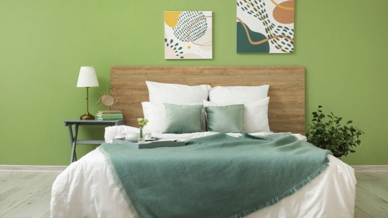
Tones such as mint or soft green evoke a feeling of freshness and harmony in the bedroom. These options are associated with nature and convey a feeling of balance and peace.
Green is especially suitable for those looking to create a relaxing and rejuvenating environment, so these tones are very suitable for youth bedrooms. You can incorporate green on the walls, bedding or decorative elements to add a touch of freshness and vitality to the space.
Lilac or lavender: relaxation and spirituality
These are ideal options for those who want to create a relaxing and spiritual atmosphere in their bedroom. These colors convey a feeling of calm and tranquility, while generating a soft and dreamy atmosphere.
Lilac and lavender are known for their relaxing properties and their ability to promote restful sleep. In addition, you can use these tones on the walls, bedding or decorative elements to create a serene environment conducive to rest.
Vibrant colors as accents or focal points
Vibrant hues can play an important role in bedroom decor. While it is advisable to use them sparingly, these options can add energy, passion and creativity to the space.
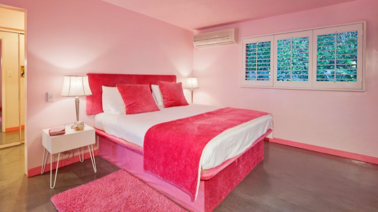
Reds: passion and vitality
The color red is known to provoke strong emotions, such as passion and vitality. Although it may be too stimulating to be used in large areas, this tone can be an excellent choice as an accent in the bedroom.
We recommend using red in decorative elements, such as cushions, curtains or accessories, to add a touch of energy and warmth to the space.
Magenta: energy and creativity
Magenta is a bold and vibrant color that brings energy and creativity to the bedroom. This vibrant shade can be used as an accent or in decorative elements to add a touch of vitality and dynamism to the space. However, it is important to use it sparingly to avoid visual overload.
Turquoise or teal: refreshing and balancing
These refreshing colors evoke the serenity of the sea. This balanced tone can be used as an accent in the bedroom to create a touch of freshness and calm. Turquoise is especially suitable for those who want to generate a feeling of tranquility and relaxation in their rest space.
Harmonious color combination and palettes
In addition to choosing colors for the bedroom, it is also important to consider the combination of harmonious shades. The right choice can improve the overall aesthetic of the space and promote a feeling of balance and cohesion.
Using the color wheel to select balanced combinations
The color wheel is a useful tool for selecting balanced combinations. You can use the rule of complementary colors, choosing shades that are on opposite sides of the wheel, to achieve an interesting visual contrast.
For example, you can combine shades of soft blue with shades of soft orange to create a balanced contrast in the bedroom. This combination can generate an interesting and attractive visual effect.
Contrast colors to create an interesting visual effect
Using contrasting colors in the bedroom can add dynamism and style to the space. In this sense, you can combine light and dark tones to create a striking contrast.
For example, a light gray wall can stand out even more if it is combined with furniture or decorative elements in dark tones such as black or brown. This contrast creates an interesting visual effect and adds depth to the room.
Using complementary shades to accentuate elements in the bedroom
You can also use complementary shades to accentuate specific elements in the bedroom. For example, if you have a soft beige wall, you can choose decorative accessories in light green or soft blue tones to create contrast and accentuate certain elements in the room. This helps create focal points and add visual interest to the space.
Additional Considerations When Choosing Bedroom Colors
You can also look at the size and distribution of the space, the decorative style and your personal preferences. Likewise, take into account the effect of color to improve the quality of sleep and rest.
Size and distribution of space
In small rooms, light, neutral colors can help create a feeling of spaciousness and lightness. On the other hand, in larger bedrooms, you can opt for darker or richer options to add warmth and give personality to the space.
Also, consider the amount of natural light the room receives, as tones may look different depending on the lighting.
Decorative style and personal preferences
If you have a specific decorating style, such as minimalism or bohemian style, you can choose colors that fit that aesthetic. Also consider your personal preferences and the shades that convey tranquility and comfort.
Remember that the bedroom is your personal space, so you should consider alternatives that make you feel comfortable and relaxed.
Effect of color on the quality of sleep and rest
Finally, it is important to consider the effect of color on the quality of sleep and rest. Some, such as soft shades of blue and green, are associated with relaxation and can help induce restful sleep. Avoid stimulating and bright tones in the bedroom, as they can interfere with proper rest.
Also keep in mind that each person may have different reactions to colors. It’s important to listen to your own body and how you feel in response to specific shades. Notice how you feel and sleep in different shades and adjust the palette to your needs.